)
Edit Mode
By clicking the 'Edit' icon (pencil icon) on a record view, you will be taken to a form with editable fields allowing you to change their values. In a similar fashion, clicking the 'Create New' (+) icon will show an empty form (except for default values) where initial values can be entered and the record submitted for insertion into the list.
An example of a record in edit mode is shown below.
Tip: Should you decide to abort editing, you can easily click any other link on the page to abandon the changes you made and go back to navigating the database.
There are a few different types of fields you'll encounter when editing a record that should be explained.
Simple Edit Box: This is a box that will let you enter either text or a numeric value. It will be limited to 255 characters, and is suitable to fields that require just a few words of text.
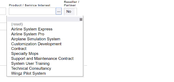
Link Dropdown: The area of this box is not editable. By clicking the ellipses (...) button, a dropdown list of records will be displayed. The user can select one of those records to set the value of the field. Once selected, the field will be displayed as a link that will take you to that area of the database when clicked. You can also drilldown through types by clicking the 'arrowhead' icon next to the name.
To make the value empty, the user can select (reset). To cancel the selection you can just click the X close button in the top, right corner.
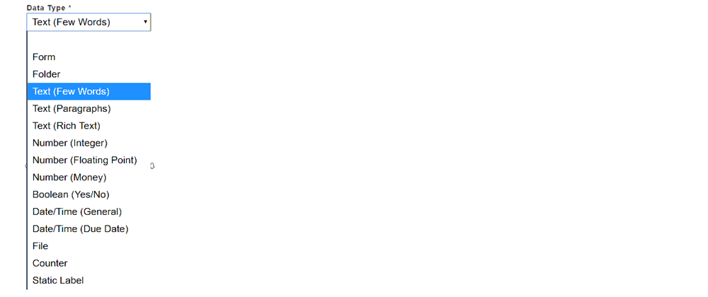
Dropdown List: The dropdown list is not directly editable in that you cannot type new text into the white area. But you can click the dropdown arrow to select a new value from a predefined list of available options.
File Attachments: The file attachment field lets you upload a file to that record. A record may have multiple file attachments configured. Depending on the browser you're using, the upload button could be labeled 'Browse' or 'Choose File' which will let you select a file to upload. When you click OK on the record editor the file(s) will be uploaded to the system.
Free-Form Text: The free-form text box (see image below) allows multiple lines (paragraphs) of text to be entered. When more lines of text are entered than can be displayed, the scroll bar can be used to navigate through the entire text.
When you are done filling in the field values you can click the Update or Create button at the bottom of the form.
If the edit was successful, you will be taken back to the record view. If there was a problem committing the changes, an error will be displayed at the top of the record view. You will then be given a chance to correct the error and submit the form once more.
Sometimes these errors messages are actually warnings which can be accepted or rejected. These will appear the same way as error messages . By clicking the OK button, you accept the warning and the change to the form will be submitted. To abandon the changes, click the Back arrow on your webpage.
Sometimes, when creating new records, you will see links within the form that will lead you to a subform. This icon is an encircled + followed by a Go-To item. Below is an example:
Clicking the (+) will expand the link to show an empty subform relating to the Go-To item that was mentioned in the link. Below is an example of the expanded subform:
You can delete that subform by clicking the 'X' in the top right, corner of the form.